TLDR
This is a static website created with Astro, versioned and continuously integrated on GitHub, hosted and continuously deployed on Netlify. Drafts are written in Notion, exported as Markdown and refined as MarkdownX. The typeface is Inter, styling is done with Tailwind, and the color palette is inspired by Dieter Rams-era Braun products. You can find all the code here.
Requirements
I needed:
- low running cost
- clean aesthetic
- simple code (I’m a newbie in web dev)
- easy maintenance
This process was inspired by three people I follow: Maggie for the ethos of the project, Riccardo for the technical side, and Arun for the design.
Tech
Build
First of all, this is a static website, which means it is built almost entirely beforehand. Hosting mostly serves HTML files, with some JavaScript where needed, while the client has very little work to do. This makes for a fast, lean website with little to no maintenance needed.
There are several static website builders and frameworks. The best known are Gatsby and Hugo; I opted for Astro, a relative newcomer with several tricks up its sleeve.
For styling I used TailwindCSS, which I found easy to use and very well documented.
Deploy
Keeping this site online costs about 10 euros per year, which corresponds to the cost of the domain. Hosting is free via Netlify as well as content delivery via Cloudinary. Both services offer very generous free plans, more than enough for me at the moment.
Where to start
I’m a newbie in web development, so I chose to start from an existing Astro template, tweak it, and learn by trial and error.
Exploring the Astro Theme Gallery, I found the Nimbus Narrative template. It had a clean aesthetic and interesting features, such as article series and a table of contents, so I chose it.
The result you see today includes several changes and improvements over the original version, such as a fully responsive layout and fonts, plus a new blog page layout.
Tips to start at lightspeed
-
Use VScode and install the following extensions
- Markdown
- TailwindCSS
- Astro
-
Understand Astro project structure
-
Understand key Tailwind concepts
- responsiveness
- dark mode
- flex and grid
refer to the documentation.
Design
The aim was to create a space that feels cozy like a diary, yet simple and practical like a good tool.
Layout
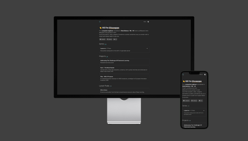
The content sits in a column in the center of the page, with a size chosen to improve readability. This lets your head stay still while only your eyes move, which makes reading faster and easier.
The layout is responsive but remains consistent across mobile and desktop, to simplify development and keep a familiar feel. On larger screens, the font size increases and some additional content appears, like the table of contents on blog pages.
The only decorative element is the outlined border style, which, I think, manages to look nice while neatly separating sections.
Colors
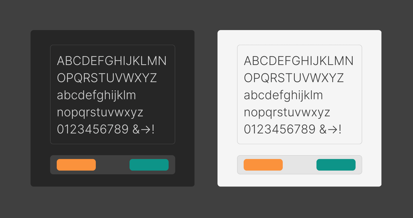
The website has a dark and a light version. You can switch between them with the button in the top right.
I kept the background simple, choosing two shades of grey very close to black and white. I did the same for the text. This combination improves readability and reduces eye strain.
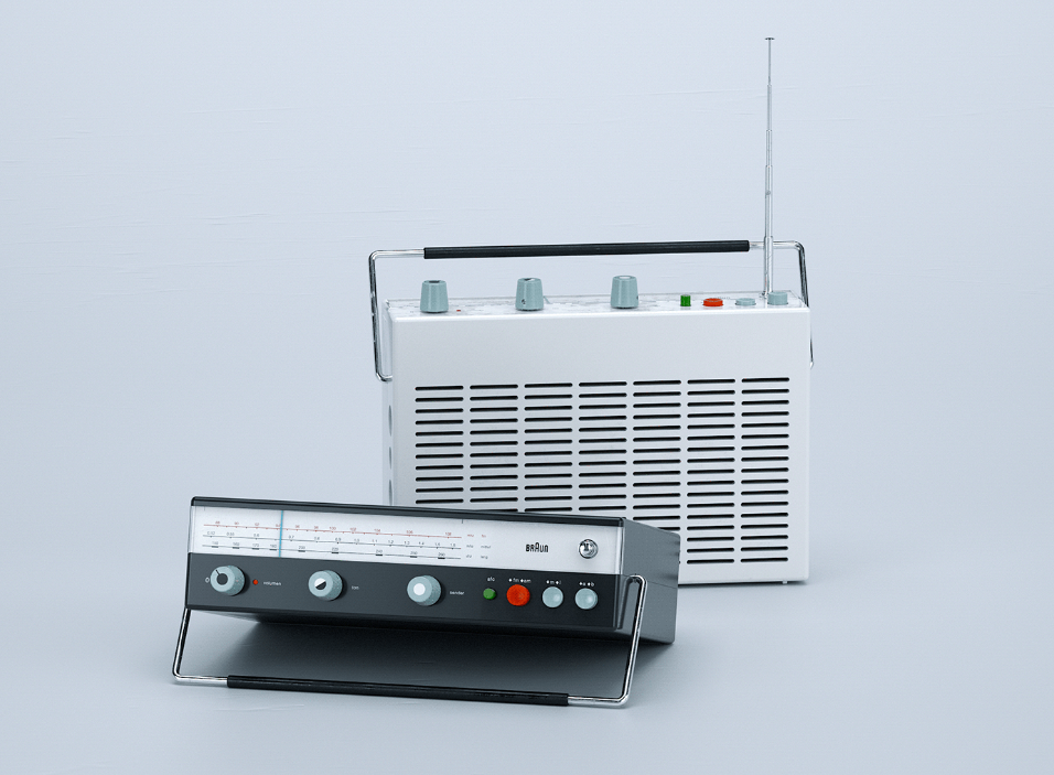
Accent colours are something I still need to work on. For now, the inspiration came from iconic Braun products designed by Dieter Rams: on top of plain backgrounds, a few colours popped out, each with a clear and intuitive meaning.
-
I chose Teal Green to indicate going forward: by clicking on it a new page would open, be it internal site navigation or a link to other websites.
-
I chose Orange to indicate going back, it is used only for the home navigation button on the top left.
Typography
I played it safe by choosing the Inter typeface by Rasmus Andersson. It is a wonderful project that aims to be the Helvetica of the digital world by prioritizing readability on screens. The project has been very successful, and even though it is quite new, you can already find it everywhere, including NASA instrumentation.
After trying different weights I settled on 300 - Light.
Details
- Illustrations are created with Canva
- Compared to the original theme, the blogpost page has been completely redesigned. The main content now sits in the central column, while the table of contents appears on the right on desktop, making better use of the empty space. Before, it appeared in the central column, hurting the cohesive aesthetic and becoming awkward for longer posts.
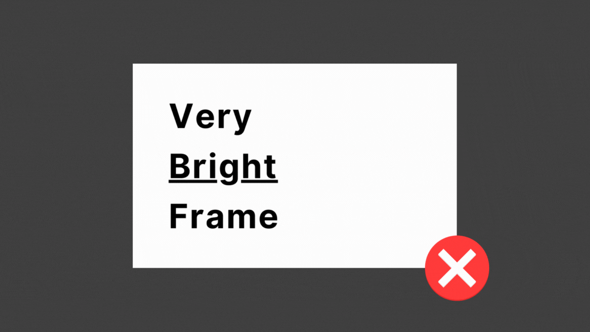
- When using dark mode, a light grey overlay is placed on top of some images and iframes (especially bright white ones) to blend them better with the page.
Daily usage
The website code lives in a GitHub repository, linked to Netlify for CI/CD.
When I feel like writing, I start in Notion. It gives me a nice interface, cloud backups, and ease of use.
Once I’m fairly satisfied with the result, I open a new branch in the repository and paste the article content from Notion into a new .mdx file.
From there, I can start to refine it for the website. For example, MarkdownX lets me add interactive elements.
Once I’m close to finished, I open a pull request. Netlify automatically picks it up via GitHub Actions and provides a preview deployment for testing.
Once I’m happy with the result, the PR gets merged, Netlify picks it up, builds and deploys the new main version.
What’s next
- Add animations.
- Think of a way to make the homepage less utilitarian.
- Learn to do better illustrations.