
It worked—and that was not enough
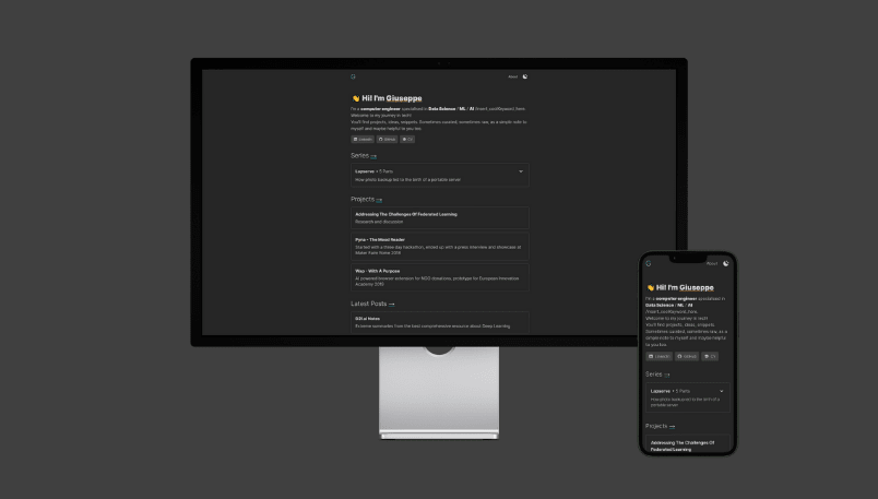
My first personal website was deliberately practical. It gave projects and notes a consistent home, loaded quickly, and asked for very little maintenance. The design sat somewhere between a diary and a well-made tool.
Over time I noticed what it was missing. It could describe what I had made, but not why such different interests—artificial intelligence, space, cycling, places, and community—belonged to the same person. The homepage behaved like an index when I wanted it to feel like an introduction.
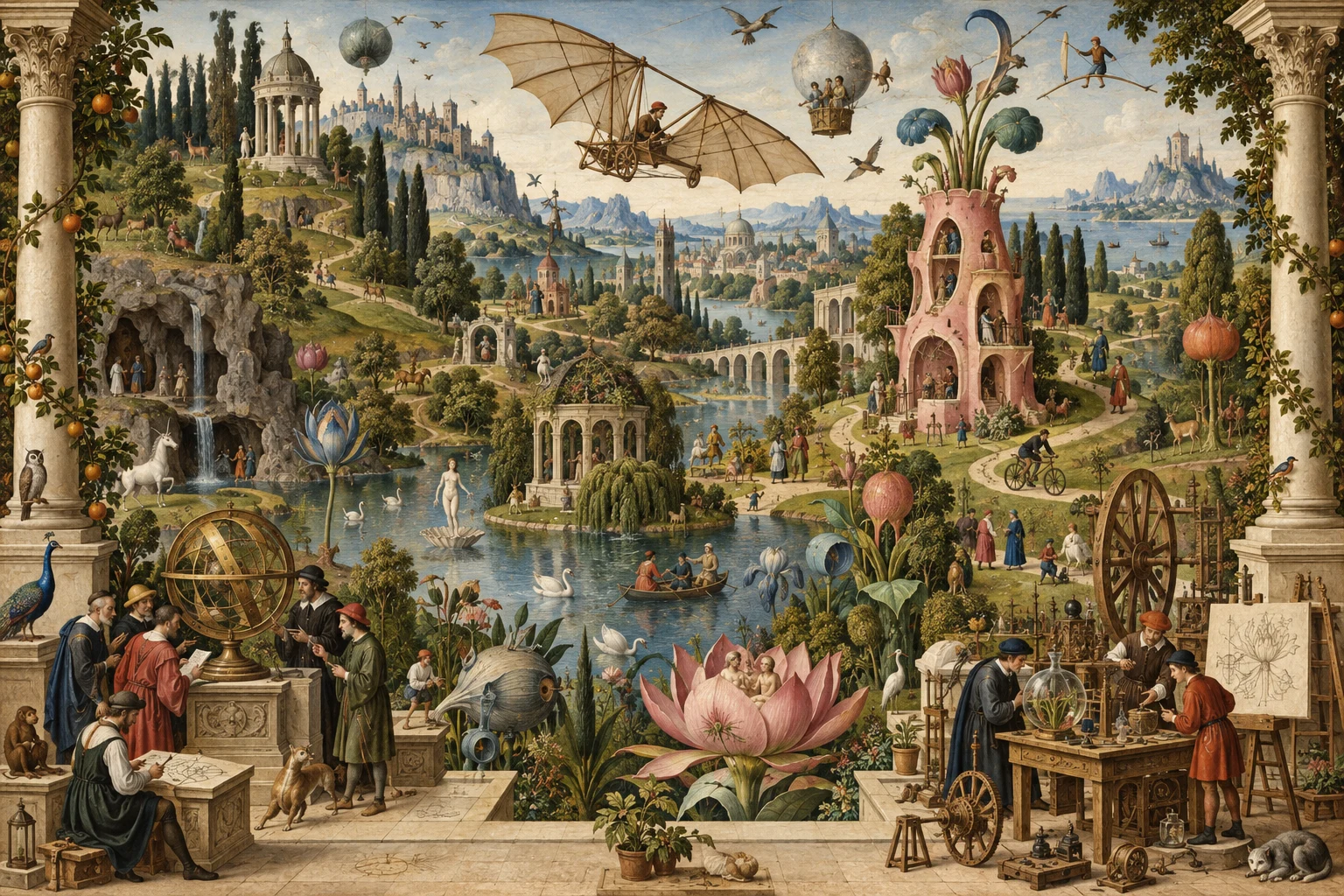
That became the reason to rebuild it. The current garden keeps the dependable publishing system underneath, but gives the work a setting, relationships, and a stronger point of view.
See the version-one project page or read the current colophon.
Technical notes
Version one was a static Astro site with MDX content and Tailwind styling. GitHub and Netlify handled previews and publication; Cloudinary held large media. The restrained stack was a success, so the redesign changed the expression of the site more than its publishing philosophy.